T20 World Cup Kits | Reviewed
The 2021 T20 Cricket World Cup is finally upon us. Rather than get bogged down in the stats, and the strike rates, and all the serious stuff we’ve decided that the most productive thing we can do at this early stage of the tournament is take a long, hard, look at all the kits set to feature and write some words about them. This is the kind of in-depth analysis you won’t find anywhere else.
Afghanistan

Solid enough kits for Afghanistan. The blue one is slightly nicer but more than happy to talk it out with anyone who disagrees. Here’s hoping the players and fans enjoy themselves. They've been through the ringer, and then some, this year.
Australia

“A wise woman… once said: ‘Worry is like a rocking chair, it goes back and forward and goes nowhere. When worry raises her ugly head, ask yourself a question. Is there anything I can do about? If the answer is yes, you don’t have to worry about it. Get to work. If the answer is no, you don’t have to worry about it either. Time to let it go. This is easier said than done, but in the interests of your health and peace of mind, worry is like a rocking chair. And, it's better to be a warrior than a worrier any day. Be happy, be healthy, be calm, be kind, be strong and be yourself.’” - Justin Langer, October 2021 (Facebook).
Bangladesh

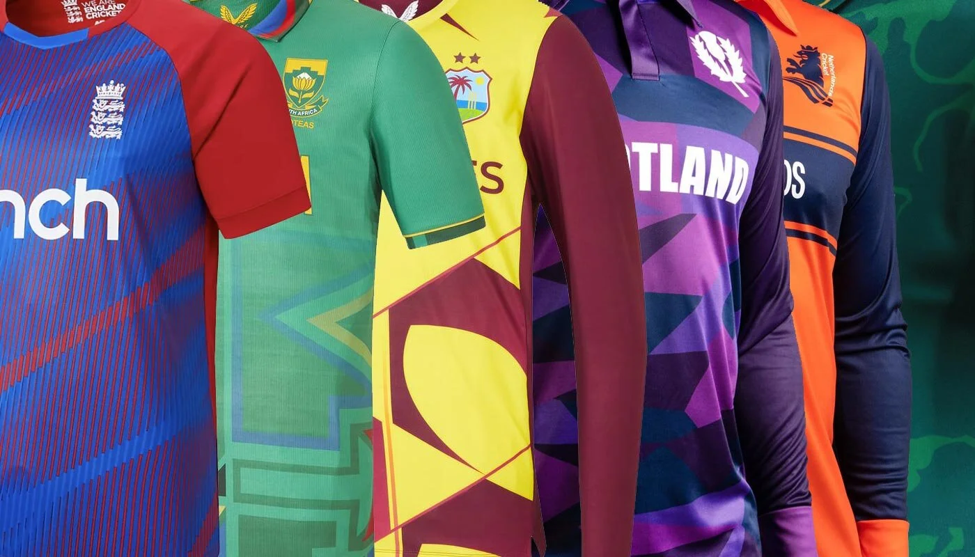
The green one with the red shoulders is a little underwhelming to look at, but the red one (the away kit) with the big green tiger-claw swoosh in the corner is decent. We like the use of recycled jacquard fabric. Not much else to say about the Bangladesh kits. Make of that what you will.
England

Opinions, subjectivity, perception; it's a funny old world isn't it? Some people love the new T20 England kit, some people think it’s the worst thing they’ve ever seen and have gone all in on signing petitions for it to be discussed in parliament.
From certain angles, the new England kit looks like a bunch of red lasers slicing through the sweaty, fog-filled air, of a nightclub in Ibiza (stick a bit of Prins Thomas on, and start cutting them shapes). From other angles, the haters will tell you, it looks like someone's tried to print out their zoomed in photo of some water on a printer that’s running out of colour ink.
Whatever your stance on the shirt, I think we can all agree… it’s coming home.
India

Projected on Dubai’s Burj Khalifa at launch (“You stay classy San Diego”), India's shirt is called the 'Billion Cheers Jersey'. Without further ado then, here goes nothing… cheers, cheers, cheers, cheers, cheers, cheers, cheers, cheers, cheers, cheers, cheers, cheers, cheers, cheers, cheers, cheers, cheers, cheers, cheers, cheers, cheers, cheers, cheers, cheers, cheers, cheers, cheers, cheers, cheers, cheers, cheers, cheers, cheers, cheers, cheers, cheers, cheers, cheers, cheers, cheers, cheers, cheers, cheers, cheers, cheers, cheers, cheers, cheers, cheers, cheers, cheers, cheers, cheers, cheers, cheers, cheers, cheers, cheers, cheers, cheers, cheers, cheers, cheers, cheers, cheers, cheers, cheers, cheers, cheers, cheers, cheers. The kit's nice enough, I guess. Cheers.
Ireland

Not entirely convinced by the dots in truth, they're a little bit insurance company corporate away day. The extremely bright shade of green though is sumptuous, a real retina-melting affair that should almost certainly come with a health warning. There's a lot to be said for that lovely Celtic pattern on the sleeves as well. An elite-level touch.
Namibia

There’s something far too LAPD / Metropolitan Police about the Namibia kit for us to fully embrace it. Whenever you look directly at this one, you can’t shake the underlying suspicion that what it really wants to do, more than anything in the world, is slap the cuffs on and take away your basic civil liberties (for a crime you didn’t commit). Admittedly, the bright blue hexagons on the darker backdrop, and red detailing on the collar, do look quite cool but also you’re not a nark and so, regrettably, it’s a no.
Netherlands

When we think of the Netherlands playing sport, it's hard not to let your mind wander to the Van Basten and Ruud Gullit era of Dutch football. Jaw-dropping crossfield passes, volleys from impossible angles, and a soccer kit so iconic it now sells for hundreds of pounds on Classic Football Shirts.
The Netherlands has, for a long time, felt like Europe's cool out of town cousin who came to visit and never left. The penchant for space cakes, the radical cycle path infrastructure, the extremely emo 'being a class painter and cutting off your ear' schtick, the open discussions about taboo subjects like sex and, last but by no means least, the windmills (ok, maybe not the windmills). Why are we saying all this? Well, it's because the Netherlands kit for this World Cup feels a bit… sensible. It's not horrible, it's just a bit 'got itself a mortgage, wife and two kids, works in accounting'.
It could have been mint. Orange is the best colour there is (don't @ us) but it feels hemmed in by the blue, a bit straitjacketed, unable to express itself to the fullest. In other words, it's not very Dutch. #FreeTheOrange
New Zealand

Nice kits. Nice country. Nice skipper. Nice bunch of boys. New Zealand are pretty much everyone's second favourite team so I'm certainly not going to sit here and write anything negative about them or their outfits. Their teal one with the enormous fern leaf, in particular, is superb. The only real tragedy is that we won't see these Kiwi kits paired up with de Grandhomme’s iconic mullet. Rest in peace, the GOAT hairstyle.
Oman

Remember when you were a teenager constantly doodling jet-engine flames at school? You were never sure why you did it, but it happened all the same. Well, the Oman kit designers never grew out of that phase. It's not a criticism of the kit, but it is quite funny to see them go down this path. Did I predict Oman's World Cup Kit in 2005? I'll dig out my GCSE maths book, and let you be the judge.
Pakistan

It would have been an act of criminal negligence to put Babar Azam, a batsman with some of the world's most aesthetically pleasing cricket shots, in a bad kit on the big stage. Happy to report that this hasn't happened here. The Pakistan shirt for this year's world cup is a work of art. The luscious shade of green swirling about in the even more luscious shade of green, the collar, the gold trim on the collar and sleeves - this one has all the makings of a classic (especially if Pakistan live up to my pre-tournament prediction, and end up taking home the trophy).
Papua New Guinea

Papau New Guinea’s T20 World Cup kit looks like the back of an 80s action movie star’s kimono, and we mean that in a good way. Definitely one of the tournament’s most eye-catching shirts.
Scotland

Smoooooooooooooooke on the water. A fire in the sky. Smooooooooooooooke on the water.
Scotland going all in on the deep purple here and stealing everyone’s hearts with a truly excellent kit. The best shirt at the T20 World Cup? Quite possibly. The thing that makes Scotland fall in love with cricket? Don't bet on it, not while John McGinn is doing the business for the fitba team. Still, a great upset win against Bangladesh in the first round of fixtures hey?
Yes sir, I can boogie.
South Africa

Both of these kits are cool but it's the green one here that steals the show. There's just something about it that hits the sweet spot. Difficult to put into words what exactly that sweet spot is, but it's very 'good vibes only'; very 'I came here to hit cricket balls, and dance in a big gazebo'.
Sri Lanka

Yes, Sri Lanka! Yes, yes, yes - times a thousand. The all blue one is good, the yellowy / gold version is outstanding. Very much into the fact that the designers have not only thought to implement a f*ck off big lion face into the kit, but have also thought to turn said lion face into *checks notes* the sun. Nice sleeves as well.
West Indies

The Men in Maroon, and reigning T20 World Cup champions, are serving up a very funky yellow pattern at this year’s big-hitting showdown. Its clunky and chaotic nature means it shouldn’t work but, somehow, it just does. Like Carlos Brathwaite (“REMEMBER THE NAME”) in that final over of the 2016 final, Castore keep on hitting it out of the park.